UA Logo
Please contact Monique Musick in Public Affairs, before using this logo.
 |
 |
 |
 |
|
|
|
|
|
|
|
|
|
|
 |
 |
||
|
|
|||
Logo Use & Specifications
The University of Alaska logo is used for visibility and positive recognition in today’s marketplace. The manner in which we present ourself will play a significant role in the public’s impressions of our institution. The goal is to keep our communications simple, dignified and coordinated, for a positive and professional image. The excellence of our print, broadcast and electronic media is reflective of the University of Alaska System, our three universities and System Office.
Each new design situation creates a new challenge. In a world where new communication vehicles and methods arise frequently, we must be flexible. This brief guide provides quick direction for the treatment of the UA logo in a variety of situations.
 LOGO SPECIFICATIONS
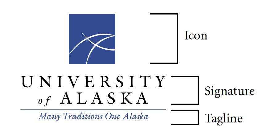
The UA logo is specifically designed to identify the University of Alaska System. This logo is composed of the representative icon, logotype and tagline. The signature is exemplified by a modern globe with stylize lines creating Alaska’s geographical location as well as representing the latitudinal and longitudinal lines of the globe. The three stylized lines also form an “A” while referring to the three campuses which creates a statewide unit.
These guidelines specify how the logo and its colors are to be used to create a foundation for visual unity, impact and consistency when used in print, broadcast and electronic media.
COLOR LOGO SPECIFICATIONS
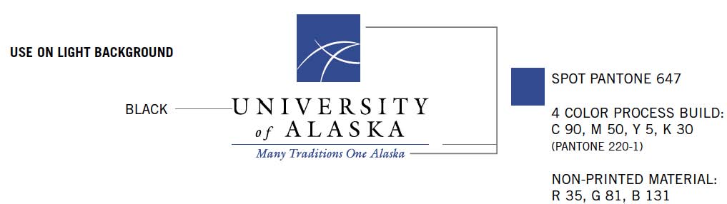
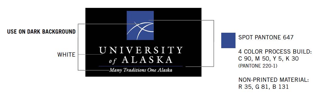
Spot Pantone 647 should be used when printing spot colors and the process build should be used when using four color printing. If Pantone 647 is not one of the spot colors, the logo should be printed in black.
Use black ink when printing a one-color logo. If not using black ink, you may print this logo in the ink required, although it damages the consistency of the logo. If printing two or three spot colors, and one is not Pantone 647, use the black and white logo only.
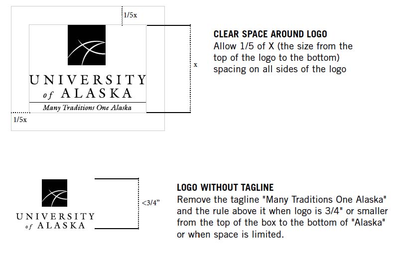
HORIZONTAL LOGOS
Since 2012, due to the need to adapt to more digital use and other print and online media we have allowed the use of horizontal logos.
AUTHORIZED UNIT DESIGNATIONS FOR LOGO USE
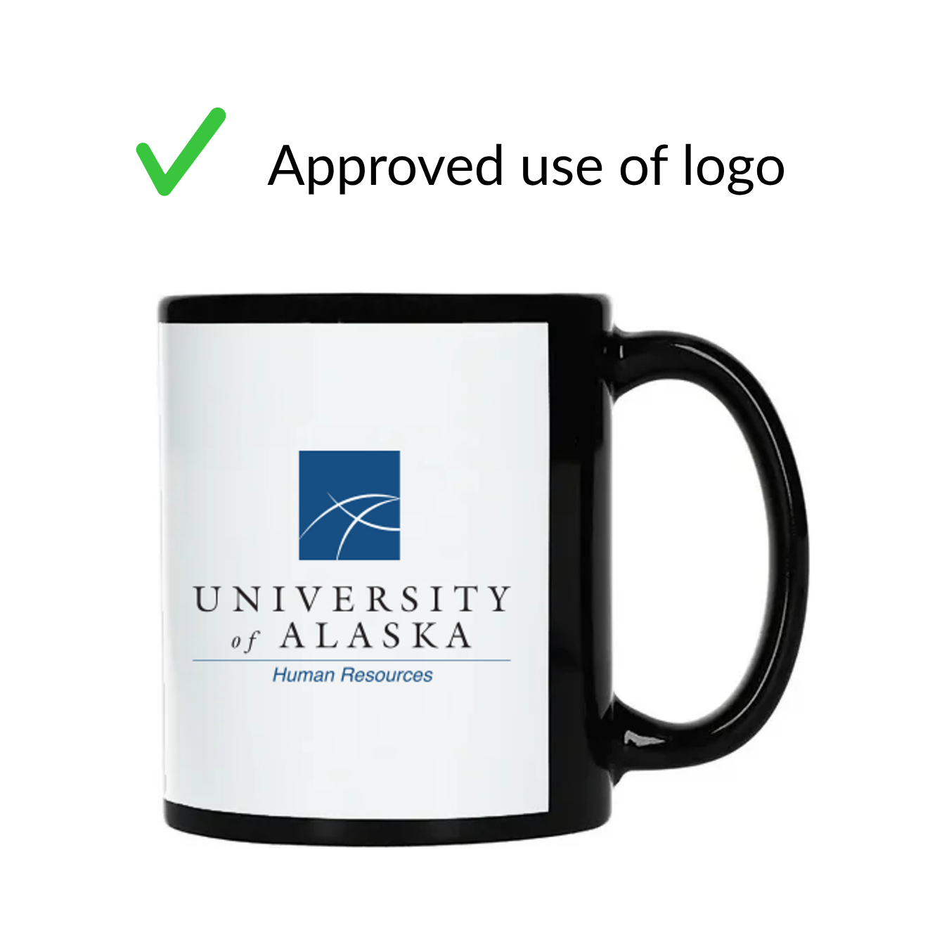
A limited exception to the exclusive use of the “Many Traditions One Alaska” tagline is the substitution of a unit designation for the purpose of branded merchandise. The University of Alaska recognizes the following System Office units as the only designations authorized for use apart from the primary University of Alaska logo. All other departments, offices and programs are not separately distinguished unless given explicit permission by the Office of Public Affairs. The tagline should follow UA Font standards as Italic Crimsen font
- Office of the President
- Office of General Counsel
- Finance and Administration
- Office of Information Technology
- Office of Academics, Students and Research
- Human Resources
- University Relations
- Land Management
- Risk Services
- Many Traditions One Alaska (no unit name designation)
GUIDANCE FOR LOGO MERCHANDISE
Only these unit distinctions are eligible for branded merchandise. When ordering custom merchandise, each department uses the unit designation it falls within. For example, the Office of Public Affairs sits within University Relations. Any merchandise it orders would read University Relations, or use the Many Traditions One Alaska tagline, rather than Office of Public Affairs.
If your department is unsure which designation applies to you, contact the Office of Public Affairs before placing an order.
TYPE LOGO SPECIFICATIONS
Never recreate the logo. Do not substitute the font in the tagline or in University of Alaska. Adobe Garamond is the suggested typeface for body copy when creating a layout, although this is not the typeface used in the University of Alaska logo.
Never use the icon/box without "University of Alaska". You may use the box/icon as a textural element in your designs as long as the entire is used in the piece also.
University of Alaska is ultimately responsible for approving uses which do not follow the established guidelines. Such uses will be carefully and openly considered.
The basic goal is to meet the needs of the University of Alaska without doing damage to the consistency of the identity system.
DO NOTS:
- Never replace the typeface either in the tagline or in the University of Alaska with your own, unless it is one of the authorized unit designations for merchadise customization in the UA storefront.
- Do not use the logo on a busy pattern or background that impairs its legibility.
- Do not stretch any part of the logo at any time.
- The format cannot be compromised: do not slant or rotate the logo in any way.